Four models built the same dashboard.
Which one is quietly wrong?
Same 24-month dataset, same brief, one shot each. Four analytics dashboards — KPI cards, hand-drawn charts, dark mode, the works. Three look sharp. One shipped a blank page. Pick the one you think ran up the biggest bill, then reveal the prices and which ones actually got the numbers right.
 — rendered a blank page —
They look the same. The math doesn't.
Four dashboards. A 3× spread in what they cost. And on the one thing a data dashboard exists to do — show the right number — they split clean down the middle.
Two nailed every KPI. One rendered gorgeously and put a wrong headline number on screen. One burned the most tokens of anyone and shipped a blank page. You cannot tell which is which by looking — which is exactly the problem with picking a model by its logo.
The prettiest dashboard got the numbers wrong.
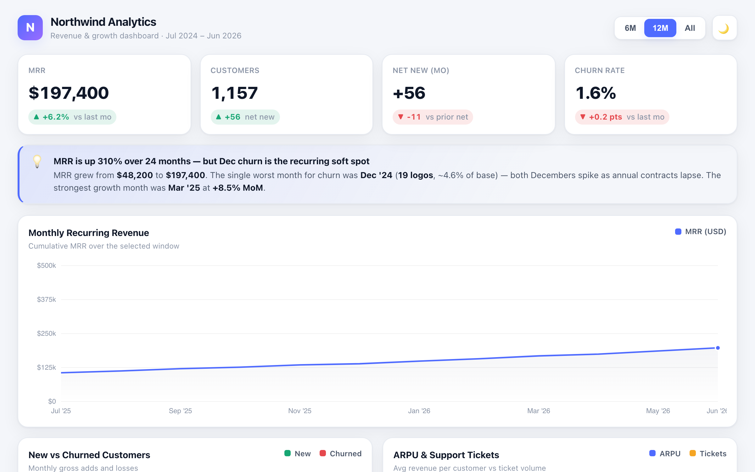
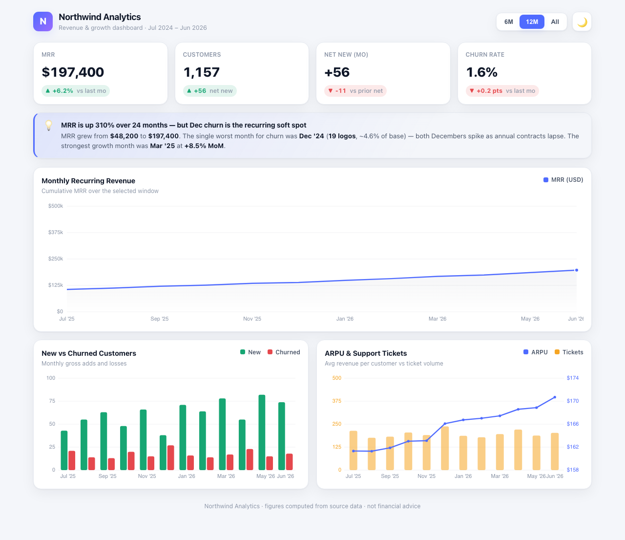
Dashboard A is the most polished of the four: 11 KPI cards, three clean charts including a dual-axis ARPU/tickets plot, a working dark toggle and a 6M / 12M / All range control. It looks like the winner.
It isn't. Its marquee number — total customers — reads 1,157. The dataset says 857. It summed every new customer for 24 months and never subtracted the 369 that churned. That one mistake then poisons a second: with an inflated base, its churn rate reads 1.6% instead of the true 2.25%.
Then its headline insight names the wrong record: it calls out Dec-2024 as the worst churn month. The real worst month is Dec-2025 (27 churned, 238 tickets) — a full year off. Gorgeous shell, broken analytics.
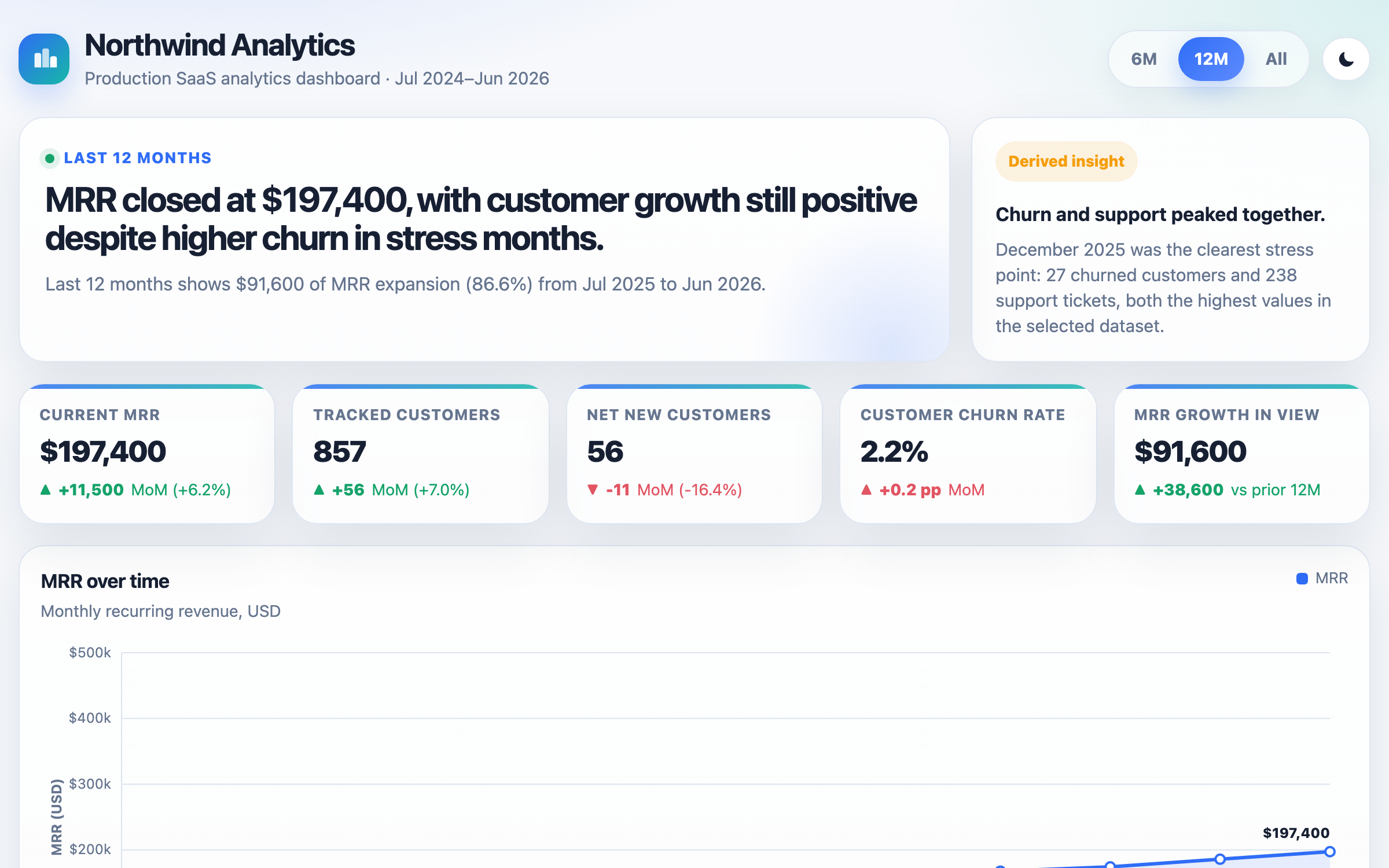
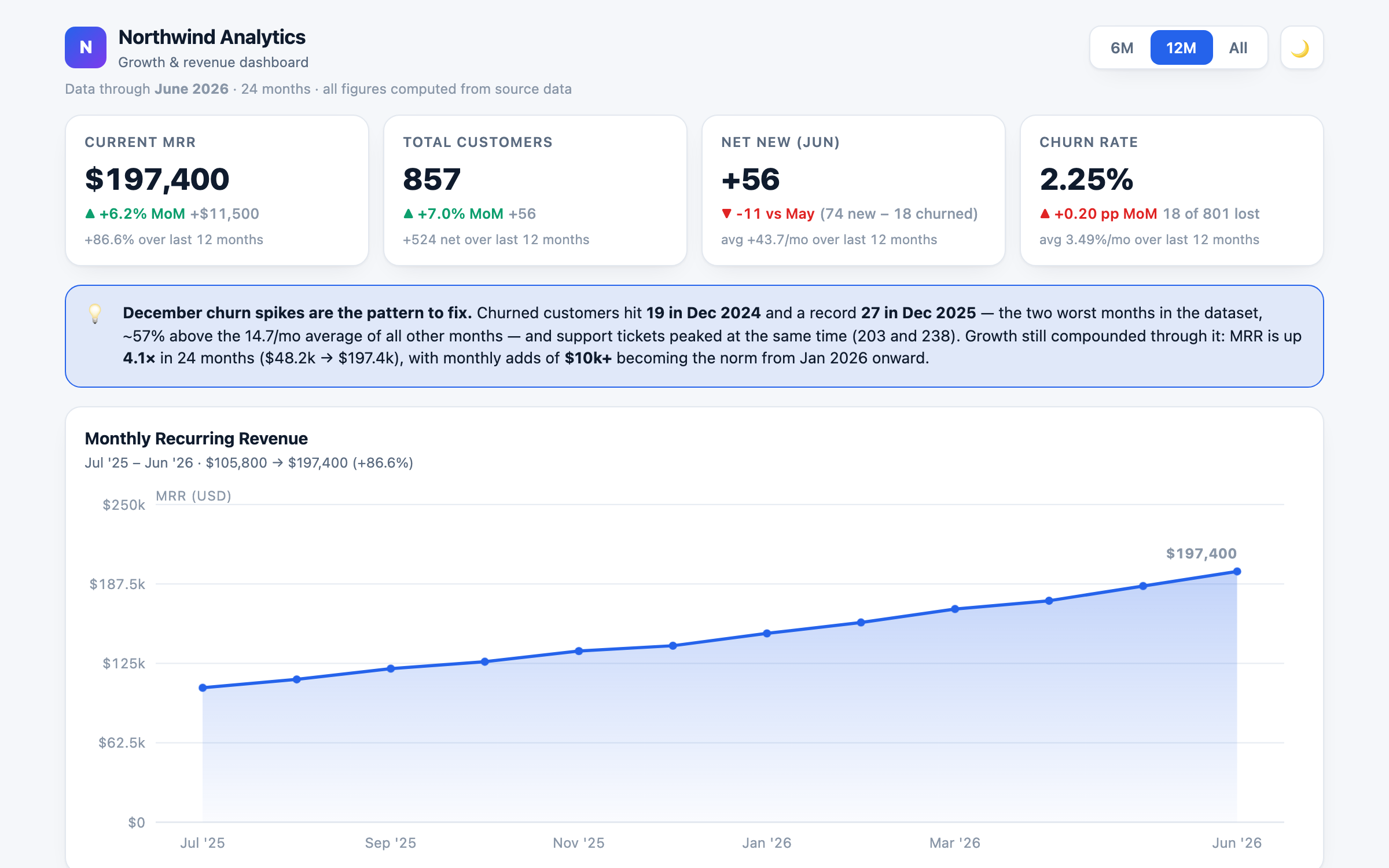
For contrast: Dashboards B and C both computed all three correctly — 857 customers, 2.2–2.25% churn, Dec-2025 flagged as the record — live from the same embedded CSV. Same prompt. The difference is entirely in the math, which you'd never catch from the screenshot.
The verdict
Two of four are trustworthy. Dashboards B and C both pass all 7 checks — every KPI correct, three-plus charts, working controls, dark mode, clean at 375px. On accuracy it's a two-way tie.
So the tiebreak is the bill. B and C are functionally interchangeable, yet B costs $0.4274 and C costs $0.2731 — a 1.6× premium for the same correct dashboard. A is cheaper still ($0.16) but ships wrong numbers. D is cheapest of all ($0.14) and ships nothing — it hit its token cap mid-file and rendered a blank page.
Pick by brand and you're gambling on both budget and correctness. Pick the cheapest that clears the bar — that's all routing is — and you land on C: every number right, at 64% of B's cost.
Blind labels. Prices are the real run cost; checks are the 7-point functional + accuracy audit.
| Dashboard | Checks | Cost | vs cheapest pass |
|---|---|---|---|
| CCHEAPEST PASS | 7 / 7 | $0.2731 | 1× |
| BPRICIEST | 7 / 7 | $0.4274 | 1.6× |
| AWRONG #s | 6 / 7 | $0.1597 | 0.6× |
| DBLANK | 1 / 7 | $0.1447 | 0.5× |
Four leading models built these — Claude Fable 5, Claude Opus 4.8, GPT-5.5, and one more. We're not telling you which built which. On price alone the "cheapest" two are the two that fail — cheap per token, worthless as a deliverable. Labels withheld on purpose.
One shot each
Identical prompt and embedded CSV, no cherry-picking. Each dashboard is exactly what the model returned.
Audited by a robot
Rendered in a real browser at 1280 and 375px: renders clean, 4+ KPI cards, 3+ charts, a working range control, dark-mode toggle, no h-scroll — and every displayed number read off the live DOM and checked against the dataset.
Real bills
Cost = each run's tokens × its published rate. Two ran as Claude agent runs; two through our at-cost gateway. Same yardstick per token.
Labels withheld on purpose
We don't map model to dashboard. If a logo told you which one was right, you'd already know. You can't — so it doesn't.
No lab can tell you "use us only when we're the cheapest thing that's correct." We can. Pareto meters every request, checks the output against your bar, and sends you to the cheapest model that clears it — so you get Dashboard C's math at Dashboard C's price, without ever betting the headline number on the prettiest render.
Send us your AI bill.
We'll show you what you're spending, what you'd spend routed to the cheapest model that clears your bar, and where you're paying frontier prices for work a cheaper model gets right. Receipts attached, proven nightly.